Case study: information architecture
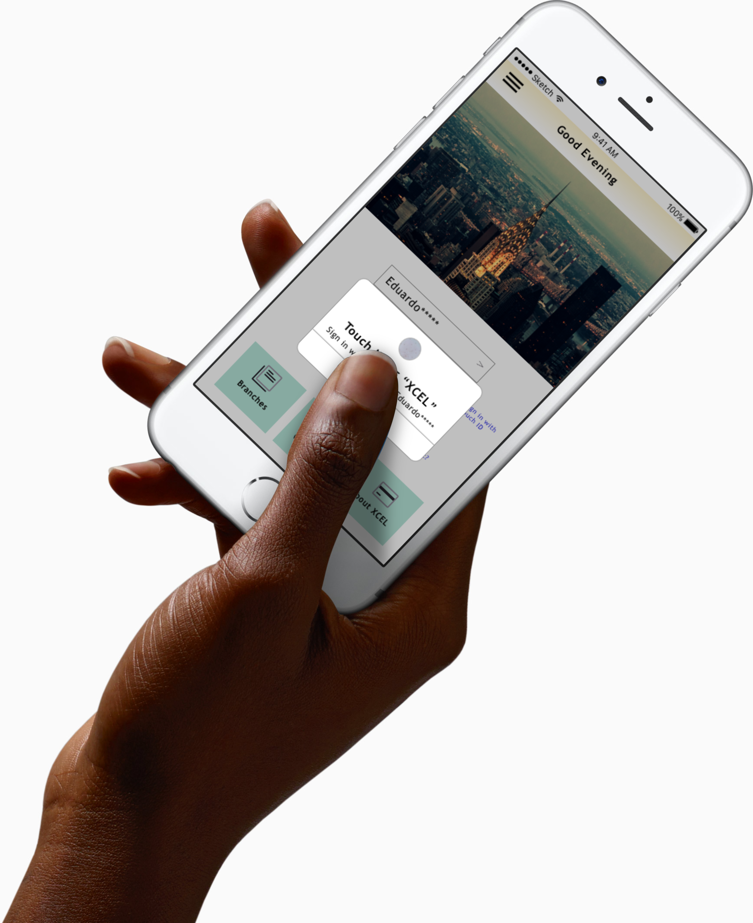
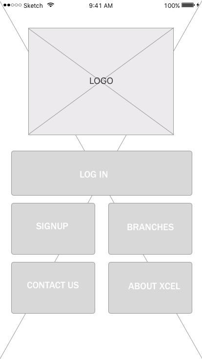
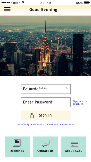
Concept Rendering for XCEL App design
SKILLS
Competitive analysis, Comparative element analysis, Content Inventory, Survey development, User interviews, Card Sorting, Contextual inquiry, Usability testing, User journeys, Wire framing (low to high fidelity), Prototyping, User testing
TOOLS
Omnigraffle, Sketch, inVision, Excel, coffee, pencil and paper, whiteboard.
CLIENT DELIVERABLES
Research Report, High Fidelity Prototpye, App Map, Fully Annoted Spec Doc
OVERVIEW
XCEL is a regional credit union that is looking to update their current mobile banking platform. They would like to add or improve a feature that will allow XCEL to optimize their mobile app in order for their users to have a better online experience.
MY ROLE
I was a part of a 3 person team, in which I was the Project Manager. My main role was to ensure that our team stayed on track and combat scope creep. While we each had a focus we partnered on all aspects of the design.
CONTRIBUTIONS
Competitive / ComparativeResearch
Synthesised data for research report
App Map
Content Analysis
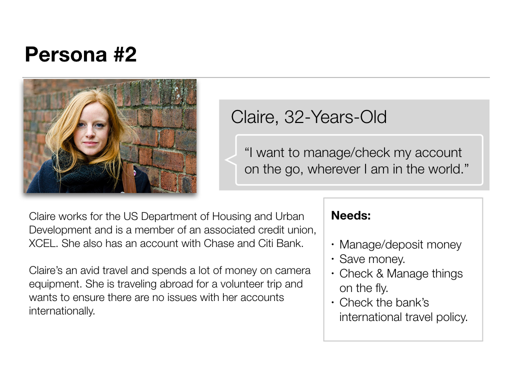
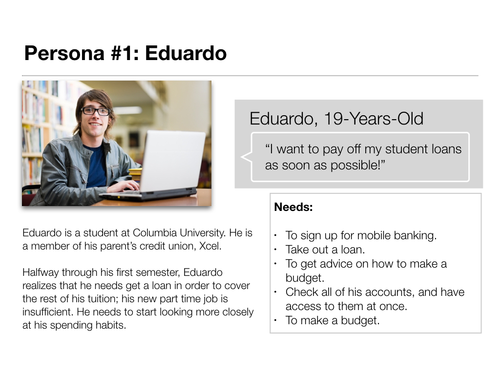
Personas
Design Ideation
Low and Mid-FI Wireframes
Mid-FI and High-Fi Prototyping
Design presentation for client

Results from our surveys of features mobile currently use on their mobile apps.
THE OPPORTUNITY
Redesign the current app where the features are accessible, remove 3rd party vendors, and provide the customers with a sense of security. As a group we set out to study other credit unions and mobile banking apps, and learn from their strengths and weakness'.
The over arching findings gathered from the interviews were:
While credit unions “felt” better they were unable to manage many of the standard daily banking needs like depositing checks.
Users really only went to a Credit Union to get better rates but still maintained their banks as they were more convenient physically and virtually.
They don’t trust the security as much since they are smaller and their websites are often very overbearing.
DESIGN CHALLENGES

INCREASED SECURITY
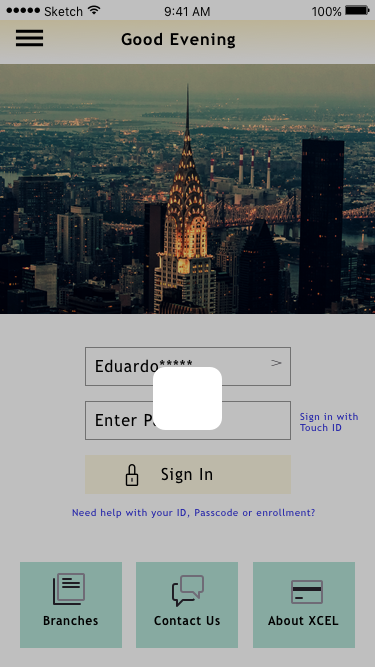
While reviewing the usability of the current app we discovered a concern about security. I am not a member and I have access to everything at the same time as a member. Some of these pages have log in portals but many are open to the public. This concern was further confirmed by user interviews.
In order to redesign this, we had to reconfigure the log in and on-boarding process so that users had to log in before accessing banking features.


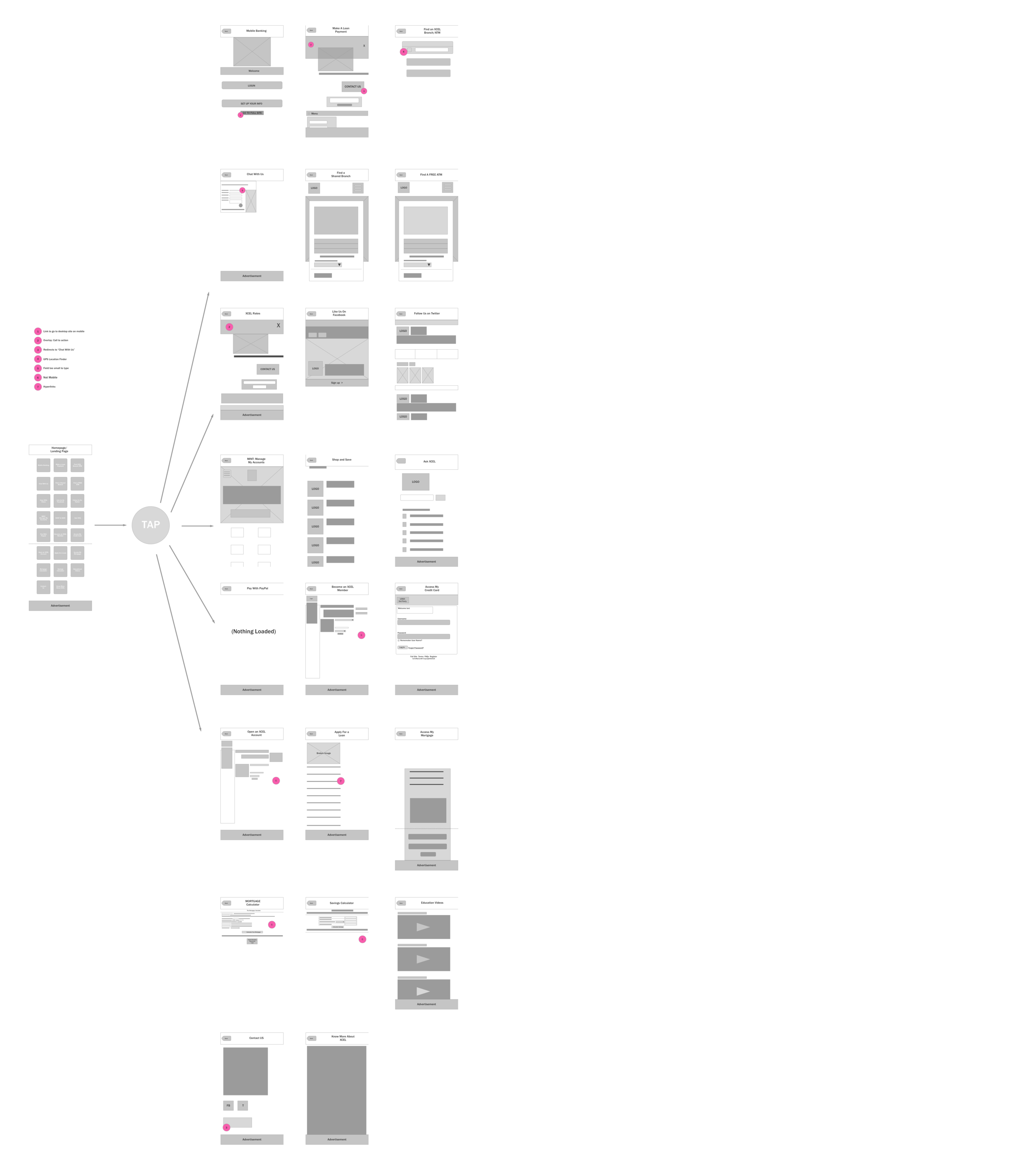
REPETITION & LACK OF FOCUS
When I first opened the app the fist thing I saw was “like us on Facebook”. As a banking institution, I would not expect this to be the focus. Maybe an option later on but certainly not in the middle of the page.
Additionally there were many buttons that were simply redundant. For example:
There were 2 chat with us options, and a third that actually turned out to be a FAQ that was names ask XCEL.
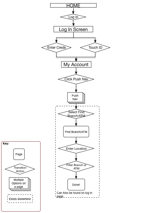
There were three ways to find a branch or ATM. Each one seem to have a different focus but really could be combined into one button with a filter.
There were so many buttons on the first page that you need to scroll to see more. However there were some rather important buttons below the fold such as savings calculators. Why would social connection be more important than managing your savings?
WHAT FEATURES CAN BE ADDED?
After analyzing all our data and research we decided on adding the following features:
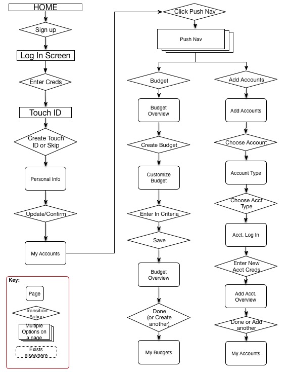
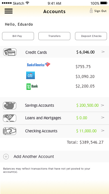
Budgeting feature designed after budgeting apps (i.e. Mint, Simple). This would allow the user to connect multiple accounts and remove the 3rd party so that the credit union can own the full process.
Travel alerts to inform car company of travel
On-boarding process for new customers
Finger print security log in to increase security
NEXT STEPS
We have shown that there is interest in a redesign and simplification of the current app. We also created new features for specific user flows based on feedback and personas. Besides addition user testing there are more aspects like personalization and refining the design to ensure we are in line with the HIG.
- More user testing.
Personalize features.
Explore expanded budget features.
Explore “Deposit Check” camera feature.
Discuss sign up and API’s with developers.
Building out remaining features.
Discussing with client what features are a ‘Must Have’, ‘Should Have’, ‘Could Have’, and ‘Won’t Have’ (wish list) to further continue to reduce and combine features in the app.