ClIENT PROJECT: Design & User FLows

Concept Rendering for Studio15 Native App
SKILLS
Competitive analysis, Comparative element analysis, Survey development, User interviews, Card Sorting, Contextual inquiry, Usability testing, User journeys, Wire framing (low to high fidelity), Prototyping, User testing
TOOLS
Omnigraffle, Sketch, POP, inVision, Excel, coffee, pencil and paper, whiteboard.
CLIENT DELIVERABLES
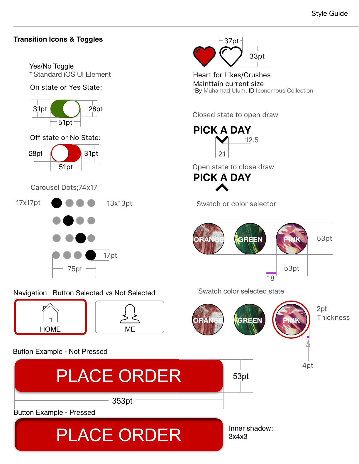
Research Report, High Fidelity Prototpye, Site Map, New style Guide, Fully annoted Spec Doc
OVERVIEW
Studio15 is an up and coming fashion company with a philanthropic cause behind their brand. They offer well constructed, high quality garments at a price point that is very attractive to any demographic. Studio15 is looking to expand their offerings to their current customer base by introducing a mobile app. We believe that Studio15 can capitalize on the steady growth of the mobile shopper as well as the more recent emergence of cross-channel marketing with a strong push to the mobile app space, which will both foster growth in new customers and reinvigorate product satisfaction among existing Studio 15 clientele.
MY ROLE
For this project I was part of a 2 person team. We divided most tasks evenly and ran all steps by each other as well as challenged each others ideas to design the best outcome.
I managed the research phase by conducting interviews, and compiling all findings into our final research report. I did multiple card sorting exercises to determine how to categorize the navigation groups. In the design phase we spent a lot of time focusing on the navigation to streamline and reduce the clutter.
CONTRIBUTIONS
Competitive / ComparativeResearch
Synthesising data for research report
User Research
Personas
Design Ideation
Mid-FI and High-Fi Wireframes
Mid-FI and High-Fi Prototyping
Spec Doc
Design presentation for client

THE OPPORTUNITY
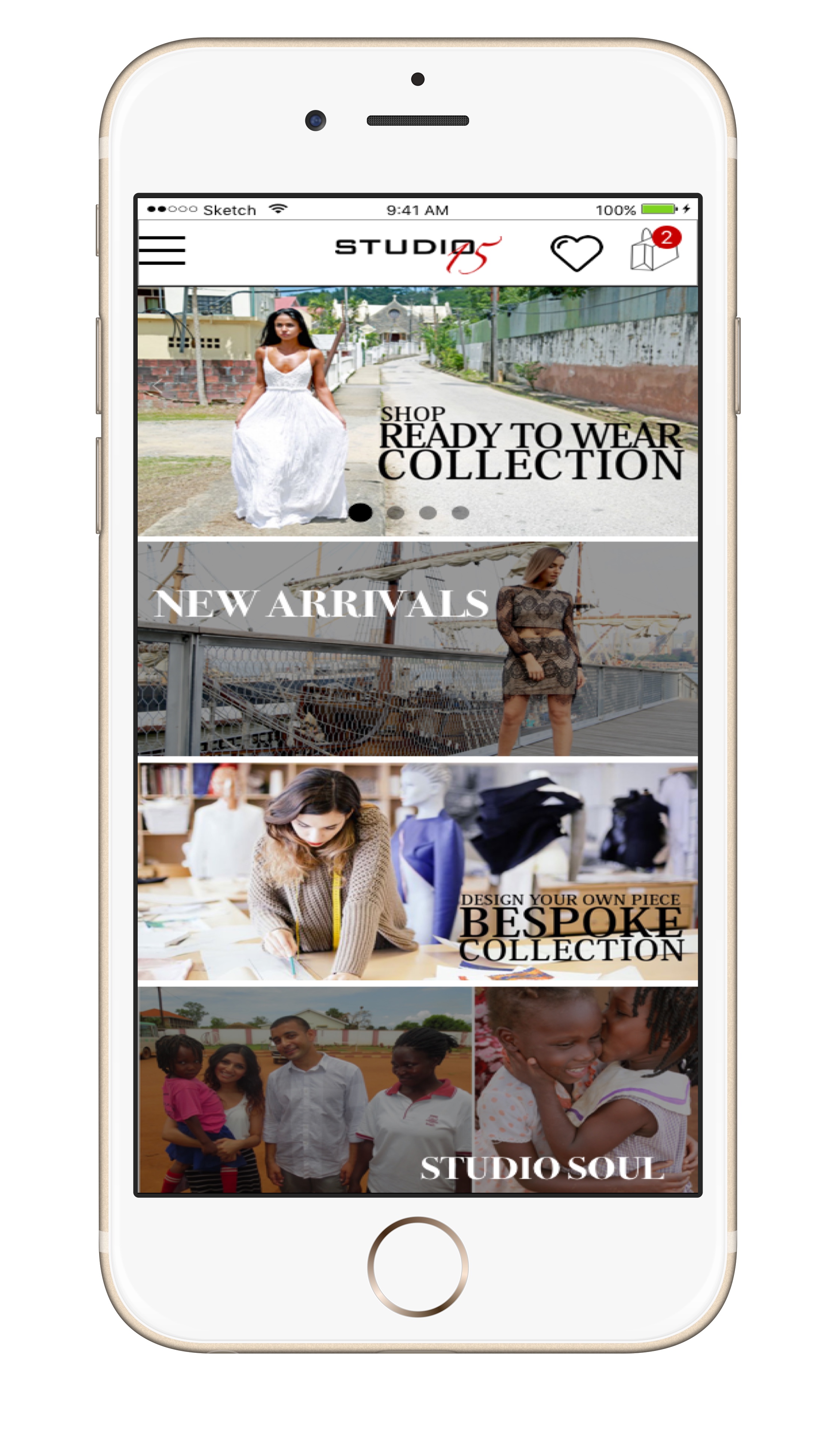
As a new company we had the opportunity to design an app from scratch, and highlight what makes this brand different from its competitors. Per client request, they wanted us to focus on two specific user flows, and finding a way to better highlight their philanthropy. We were tasked to create a design that was inline with the client goals but also took into account the growth of a young company. We wanted to create a simplified navigation that would allow for ease of future adds, and user flows to increase sales and decrease drop off.
What was interesting to learn from our questionnaire is that while 75% of the users were interested in socially conscious brands only 33.7% of those users indicated that it affected their buying choices. We saw this as our window of opportunity to showcase Studio15’s cause behind their brand in a way to drive a higher level of engagement with their customers.
DESIGN CHALLENGES

CONFUSING CALL TO ACTIONS
From the testing we performed we saw a number of users did not understand the functionality behind the “I have a crush on you” button. All of them understood “You’re the one” but mentioned that this was due to the secondary call to action that explained that it was to add the item to their cart. The client had initially used this this as a design concept of "Dating your clothing" but it did not resonate with the users.

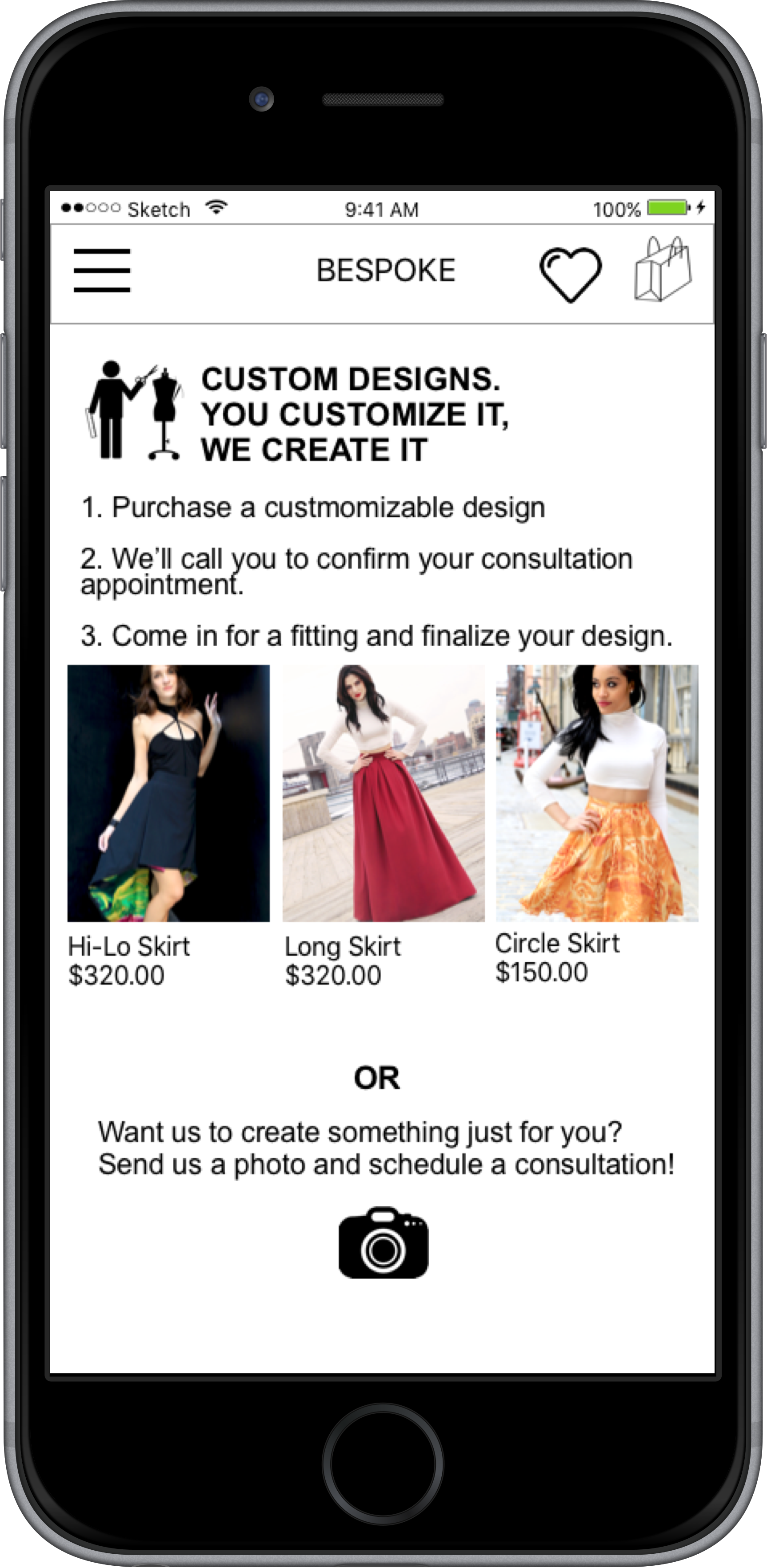
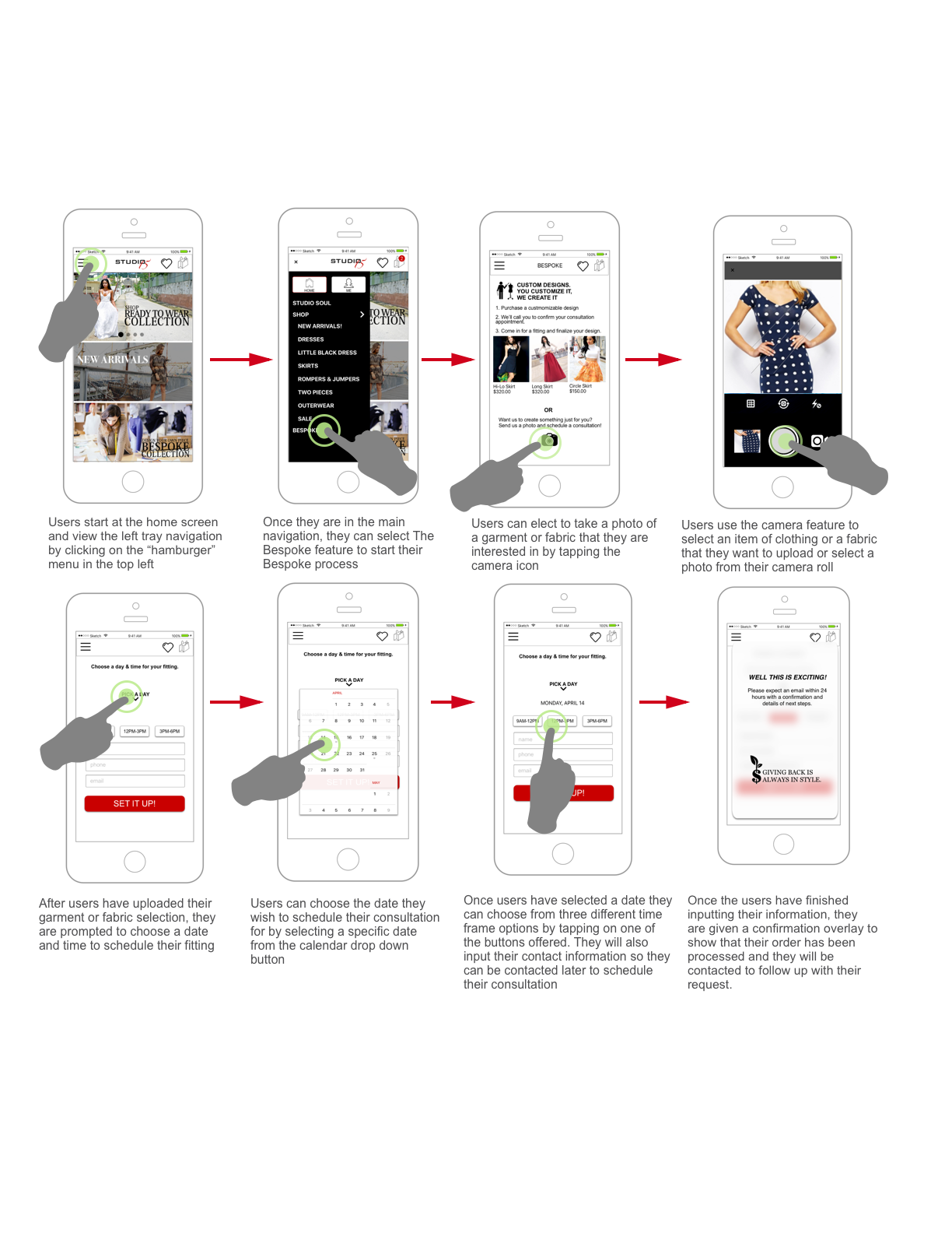
HOW DO I BESPOKE?
Redesign the Bespoke user flow to be more clear and actionable. Initially the instructions were not only lengthy but confusing. They were aSking you to do things that were not even possible in the current platform. We designed a new flow that was streamlined and guided the shopper through the process of Bespoke.
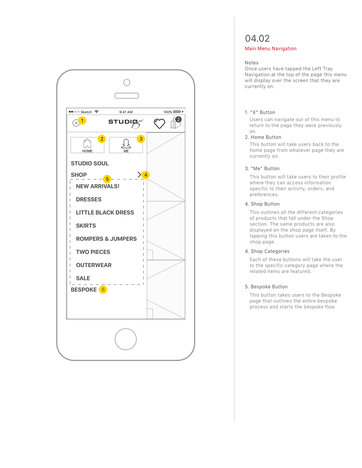
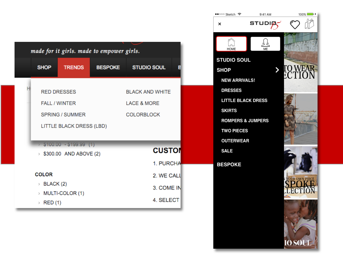
REDESIGN A CLUTTERED NAVIGATION
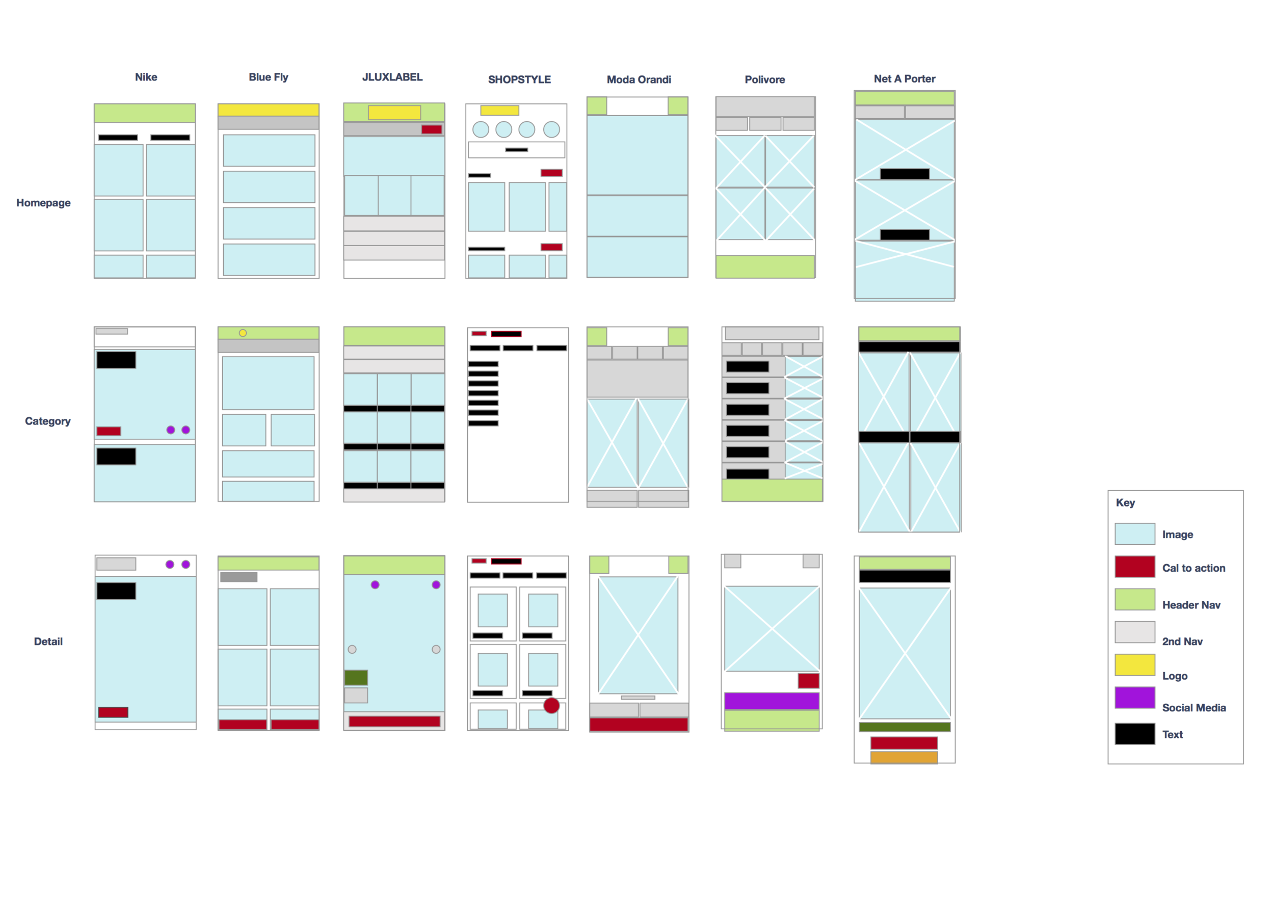
The current navigation was was confusing and redundant, and did not filter for the items that it was indicating. Our goal was to research and redesign the navigation to allow for items to be findable. We did numerous card sorts to see how shoppers preferred to sort and group, and researched some competitors and high end brands to see how other options worked.
NEXT STEPS
We completed the initial task of the client and designed new user flows for her shopping line as well as her bespoke. Additionally we redesigned her philanthropic page and highlighted this feature through the purchasing process
- Design the account of the app.
Design personal setting user flow.